Amazon Fine Foods Review Analysis
Introduction
Given longitudinal data, one should be able to understand how things change over time. McAuley and Leskovec published a paper in 2013 detailing how they used Amazon’s gourmet food section to build a recommendation classifier which builds upon the experience of a reviewer. Using this longitudinal dataset, there should be many other things that could be understood from looking from looking at evolution in a different way. For instance, we could see the trends of food over the years and maybe even capture the cupcake craze of 2011.
The goals of this analysis is the following:
- Understand the evolution of reviewers over time
- Understand the variation of helpfulness of reviews for products over time
- Visualize the changes in reviews over the 10 year period to understand what trends were important that year
The understanding of these metrics as part of the exploratory data analysis will help guide model building for classifier usage or for recommendation.
Results
Several results were seen:
- Review lengths over time become longer
- Semantic prediction of summary and review text weakly but significantly correlated according to pearson correlation
- The summary of the reviews also get slightly longer over time
- The older a product is, the more variation for review scores
- The helpfulness ratio generally increases overtime for a product
- Scattertext plots showed the evolution of the Amazon platform and shows the transition from movies to foods. Earlier positive ratings stemmed from specific products but slowly shifted towards more sentiment based relationship.
General
High level exploratory data analysis must be done on every new dataset. Some of the plots can be seen below to get a general idea of how the data is distributed.
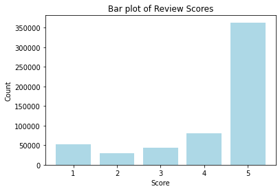
The plot above shows the overall review score distribution in the data. Most of the data collected over the years are positive and 5 stars. This would be problematic if building a classifier model.
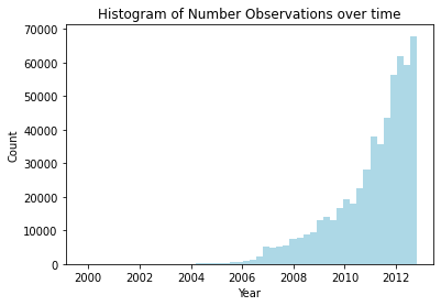
The plot above shows the number of reviews over 10 years. We can see that the reviews are growing exponentially year over year.
Sentiment
It would be interesting to see if the sentiments between the text review and headline summary titles match. Looking at the sentiment, we can potentially find an alternative feature to classify score rather than go through the heavy computations needed for NLP based analyses.
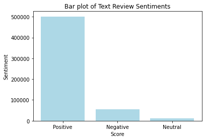
The text based data was analyzed using VaderSentiment which is a lexicon and rule based sentiment analyzer. In the plot above, we can see the distribution of sentiments which is mostly positive as expected based on score distribution.
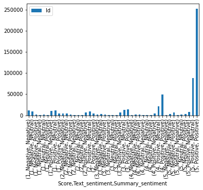
The plot above shows a very messy representation of the score to sentiment of the review text and summary. We can see that they mostly match up with 5 stars being mostly postive.
Top Reviewers over time
We can understand how reviewers evolve over time. The expectation is that as reviewers write more reviews, they gain more writing skills and potentially write longer reviews. Additionally, they might be more respected in the community and be generally more helpful.
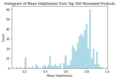
The plot above shows the mean helpfulness of the top 500 reviewers. We can see that the distribution is slightly left skewed with the peak of histogram at about 0.8.
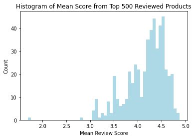
In the plot above, we can see that most of the reviewers leave generally good reviews. It is still left skewed but has a peak at around 4.4.
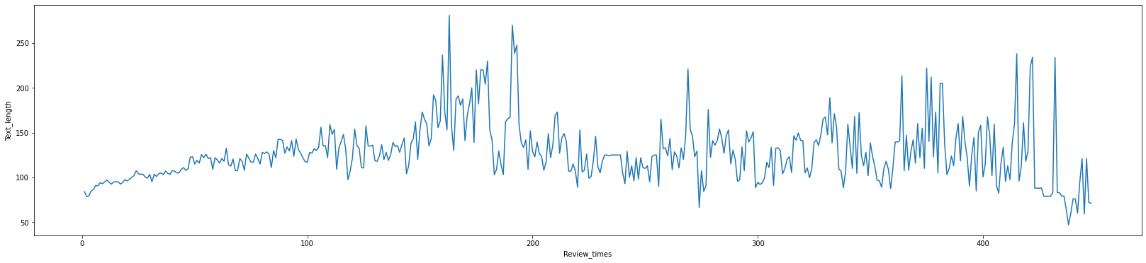
The plot above shows the median review length of the top 500 reviewers over increasing number of reviews written. We can see that the median review seems to be increasing up until around 175 reviews and then slowly decreases. The decrease however might be due very dedicated reviews who has written way more than others.
Top 500 Products over time
The top 500 products based on review numbers sampled for analysis. The thought process behind using highly reviewed products is that highly reviewed products are likely either very old products or viral products. This would likely have a wider spread of score distribution and would likely have more interesting reviews patterns.
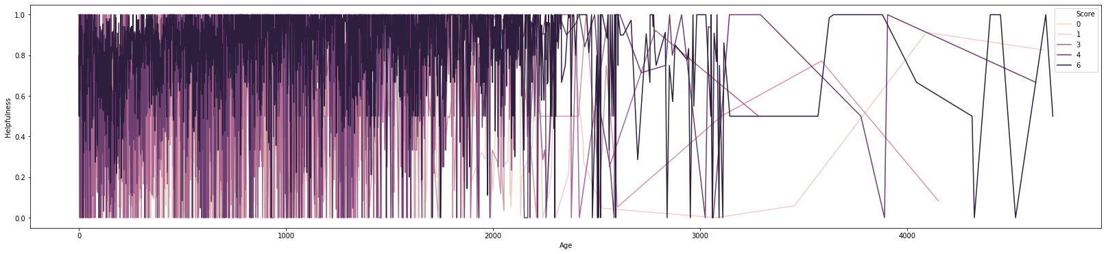
The plot above shows the mean helpfulness over the age of the products in relation to the score. We can see that the dark pattern for 5 stars seems to slowly increase up until 2000 day old products. After 2000 days, there is a lot of variation due to lack of products.
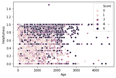
The plot above shows the helpfulness of reviews against the age of the review calculated by the oldest review per product. The plot is also colored by review score. We can see some interesting patterns with the lower scored products uniformly distributed at all levels and high ratings mostly having high helpfulness.
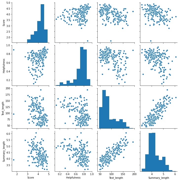
The plto above shows the pairwise plot of these top 500 products. We can see some nonlinear patterns between the variables but interestingly the length of text by the headline summary and the actual review look very linear.
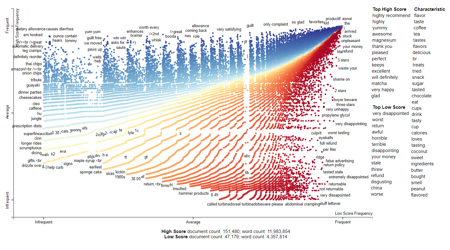
Scattertext Representations of High Ratings(4-5) vs Low Ratings(1-3)
The plots below show the scattertext representation of high ratings(4-5) on the y axis and low ratings on the x axis(1-3). The plots are also separated by year. For those unfamiliar with scatertext, this plot shows the ranked frequency of unigrams and bigrams between two different classes by default. When looking at the plots, the distance matters as separation can show how reviews differ and vice versa.
We can see the complexity of the plots increase overtime due to the increase in the number of reviews. Additionally, in the beginning years of the dataset we can see the shift from movie reviews towards very specific food items. The dataset shifts again towards general sentiments which drives the score. There are some interesting insights that can be derived from the dataset including scandals with some pet food companies, concerns with formulation, cost, sugar issues, and more. Note that 1999 is excluded as it only contains high ratings.
2000
This year is mostly movie reviews. In particular, beetlejuice was quite popular.
2001
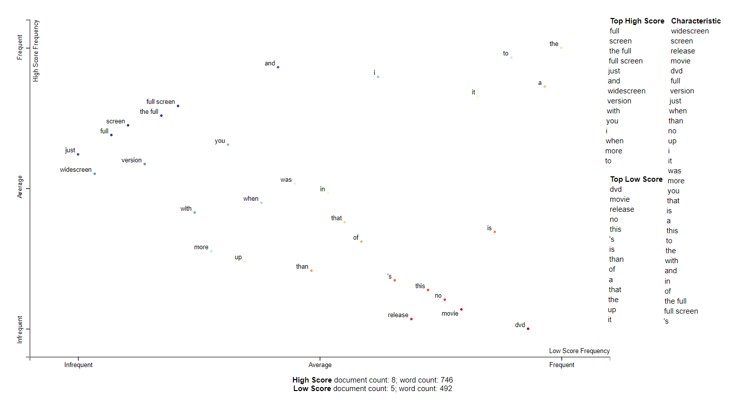
2001 was also related to movies. In particular, people seem to prefer wide screen movies and disliked dvds. Perhaps this is around the rise of dvds as the Playstation 2 was released in 2000.
2002
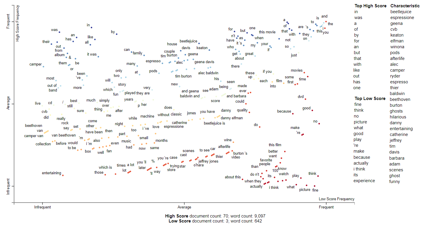
2002 is more ambiguous as the top scored words are mostly stop words. It still has mostly movie reviews and makes reference to beetlejuice as well as probably Tim Burton. It also references what is likely the Matrix 2 as some of the actors and actresses characteristic of this dataset.
2003
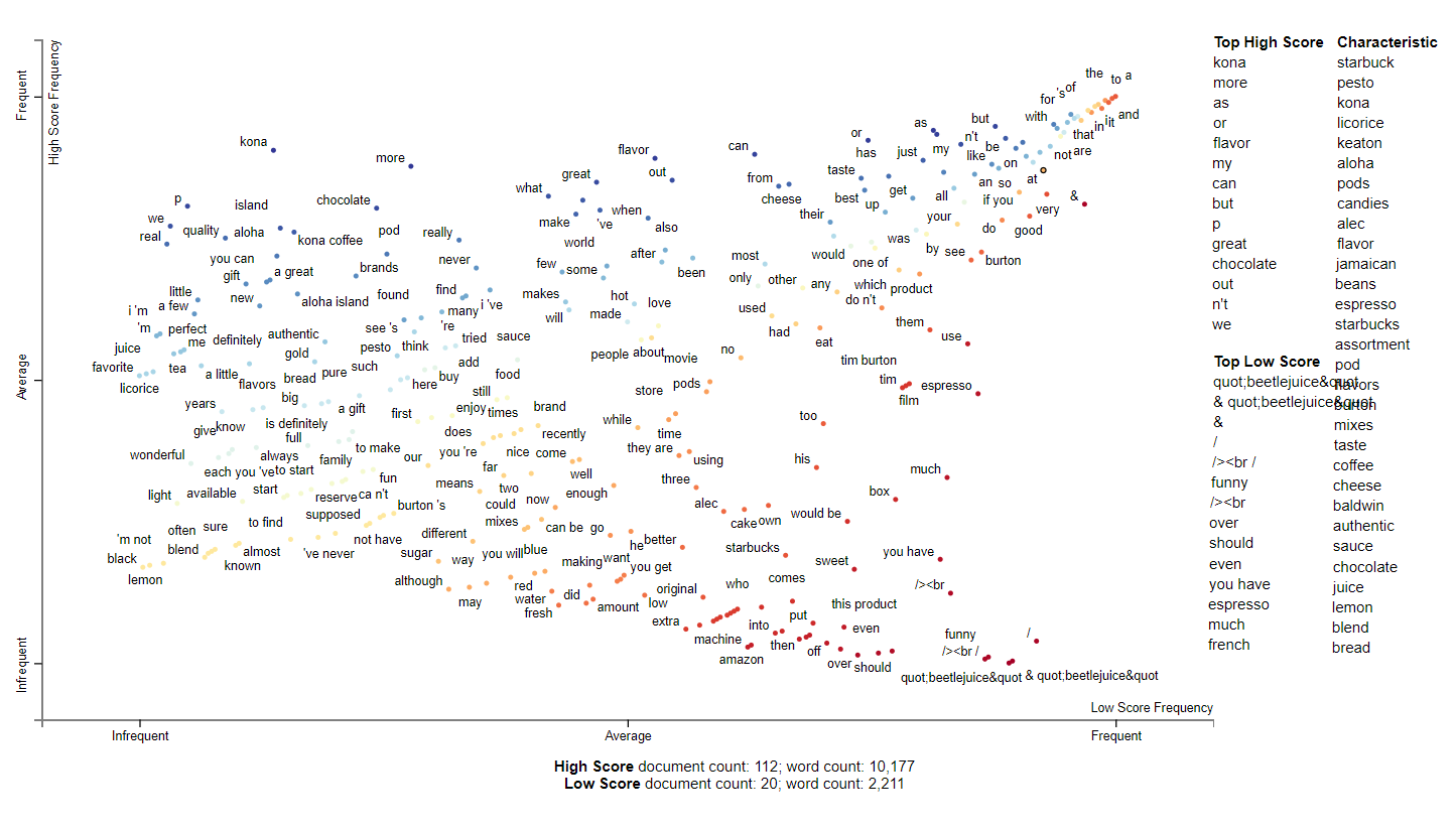
2003 is when the dataset begins to closer mention gourmet foods. It still has movie mentions and some dirty html tags but seems to have high number of chocolate and coffee related terms. Starbucks is specifically mentioned and in 2003, Starbucks bought out the Seattle Coffee Company and expanded about 2000 stores. This may be in reference to a 2nd wave coffee shop trend and return to high quality coffee.
2004
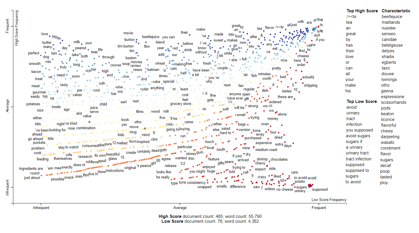
2004 is a more interesting year. There is still a large influence from Beetlejuice and Tim burton but the two trends here seem to be tea and urinary tract infections and sugar. It seems people are concerned about sugar intake this year. Senseo is also a top characteristic of these reviews and it appears that it started to appear in 2003. Senseo seems like an early Keurig machine designed to simplify coffee using pods.
2005
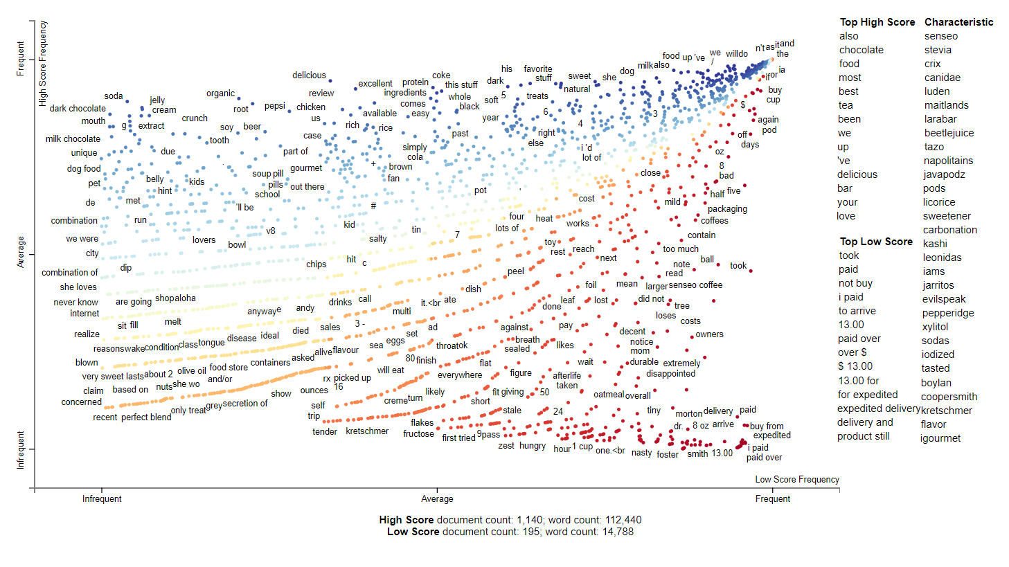
2005 seems to sweets related. We have many interesting terms here including coffee, tea, sweeteners, jarritos, larabar, and kashi. It seems this year is when the health fad happened and people began to worry about the type of sugars in their products. According to wikipedia, 2006 was when the WHO released a report saying stevia was safe for consumption so maybe it is related. In the top scored tokens, chocolate and tea have high scores. Reviews with low score seem to be price and expediated delivery related.
2006
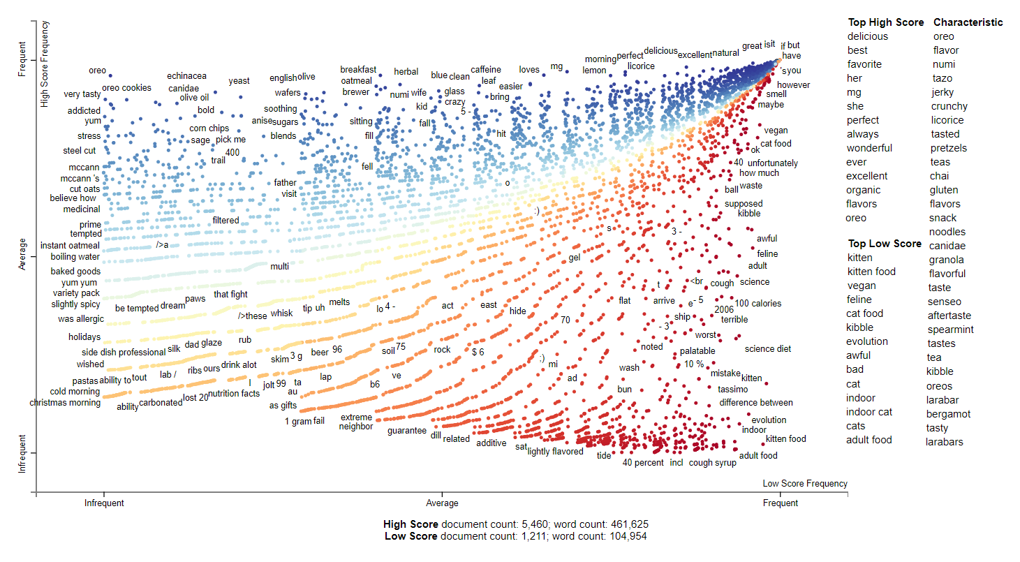
2006 seems to be dominated by cat food reviews. Looking in both the top and low scoring words, they seem to refer to either cats or dogs and feeding them good food. This might be related to the characteristic terms for kibble and canidae which begun appearing in earlier years. The trends for food according to the characteristics seem relatively similar to 2005. We see more gum, oreos, larabars, teas, pretzels, noodles, and snacks. This might be Amazon deciding to expand their food selection to more unhealthier snacks.
2007
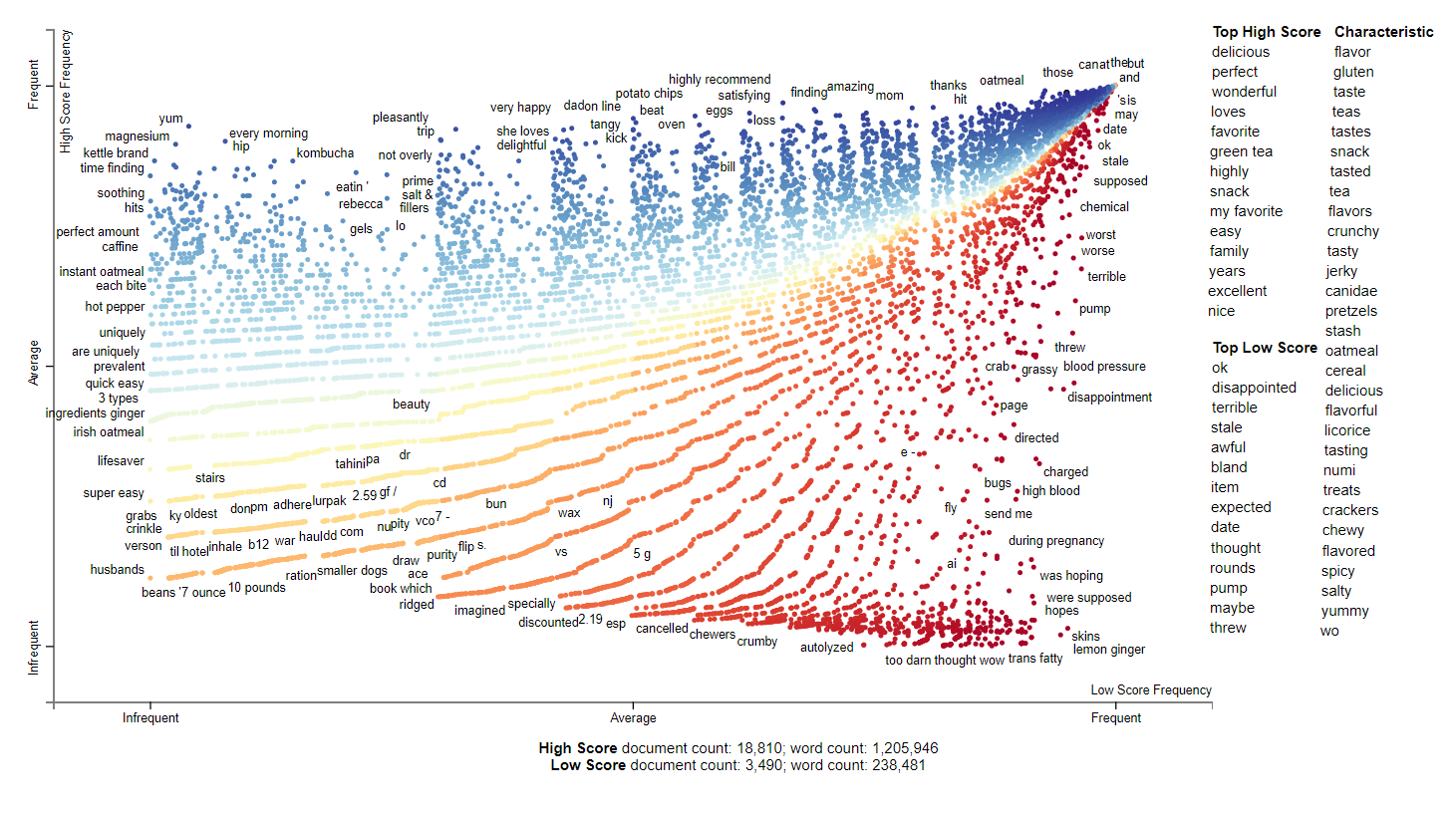
2007 has more diverse terms. Specifically, the characteristics are more desriptive compared to 2006 which was more specific products. The top scores are mostly relatively positive words that you would expect from reviews like delicious. The low scores are lower sentiment values and are works like disappointed or terrible. There seems to be complaints about pumps and that is related to a water pump for a hydroponic gardening kit from the AeroGarden.
2008
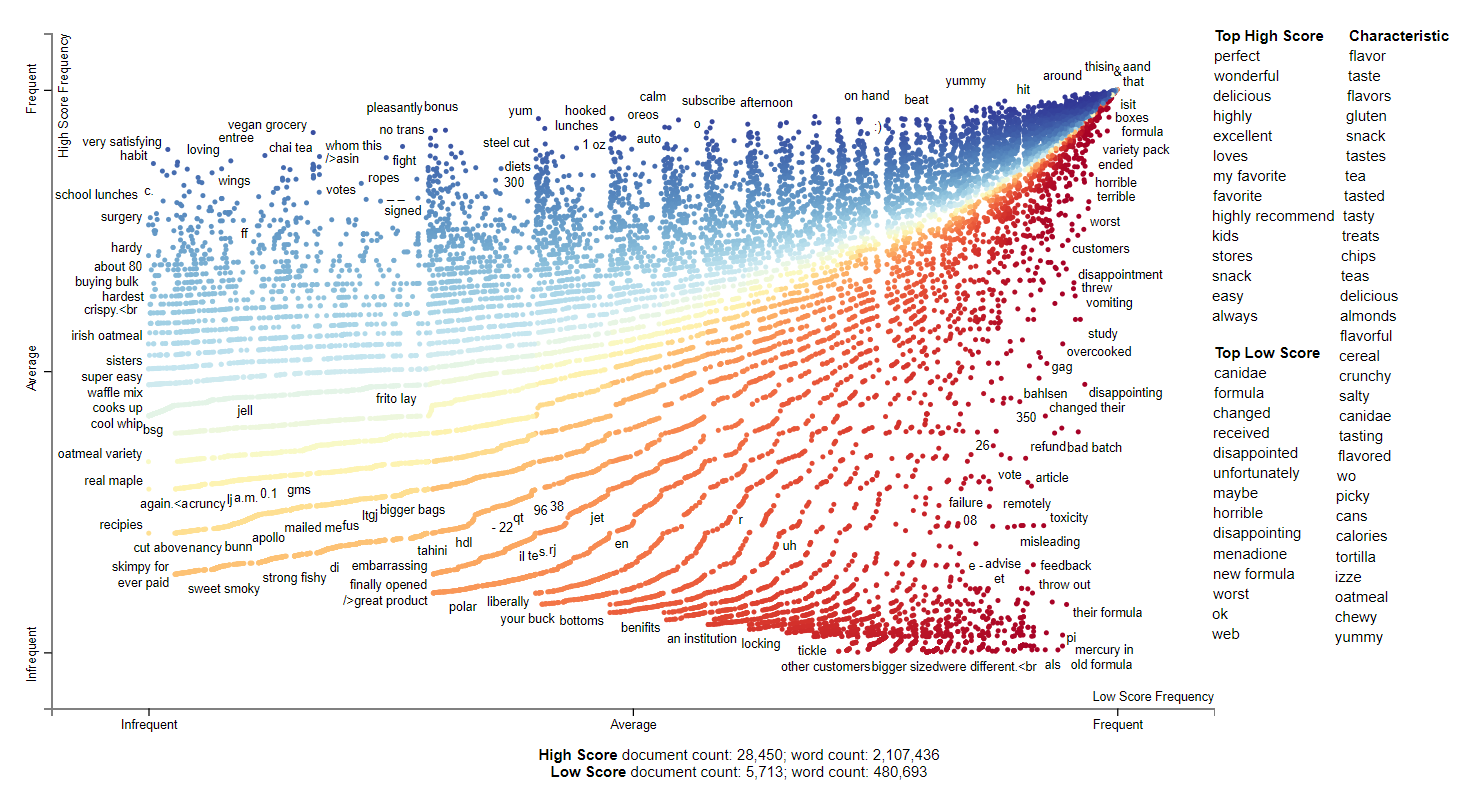
2008 has many descriptive adjectives. There are still brands that are picked up including izze, canidae but it is mostly generic terms now. The interesting thing is that there seemed to have been some issue with menadione and new formula for canidae which is very poorly received.
2009
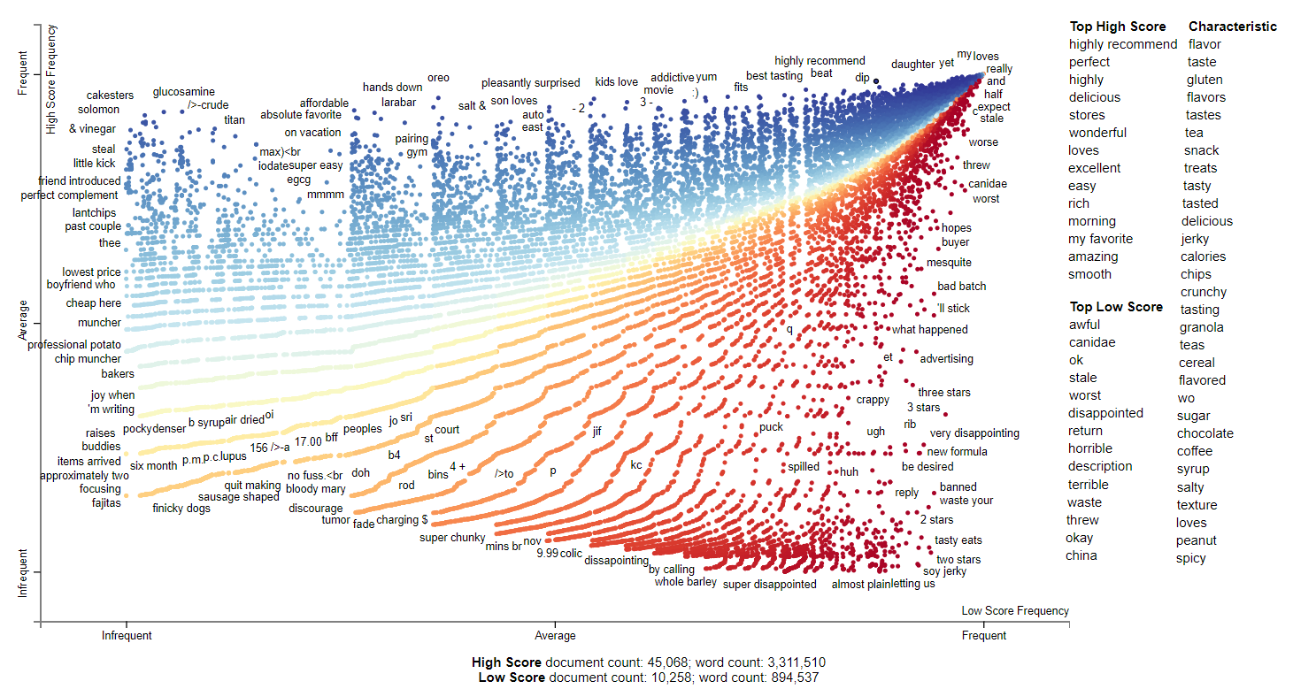
2009 still contained many adjectives. It seems like the Canidae formula changing controversy still continued in the reviews. Interestingly, there seems to be an issue with Made in China this year. Looking at some of the reviews, it seems to be dog treat related.
2010
2010 continued the trend as seen in the previous years. It seems pasta and snacks became very indicative of high scores. Some of the interesting characteristics that have been added are gluten and keurig which are known for their coffee pods. Investigating the thought she which has the top low score shows that there is someone reposting the same negative 1 star review over and over.
2011
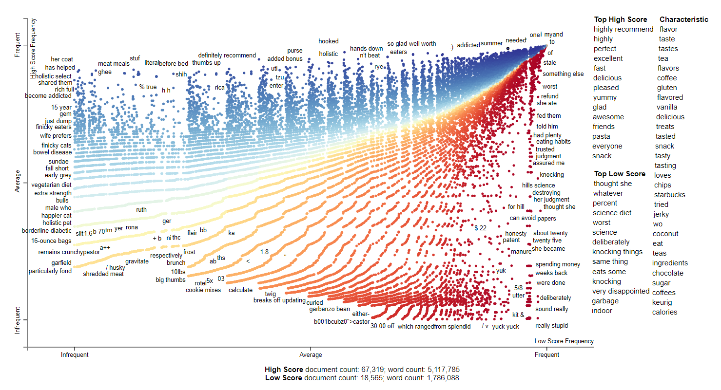
2011 only has Amazon as the only named entity. All of the primary features follow the last couple of year in trends in that it is mostly adjectives. We can see in the plot of high score frequent tokens that we have specific foods people are interested in. There is also interestingly some holistic references including the outlier term uterus. The negative reviews seems to be complaints based on expiration or taste.
2012
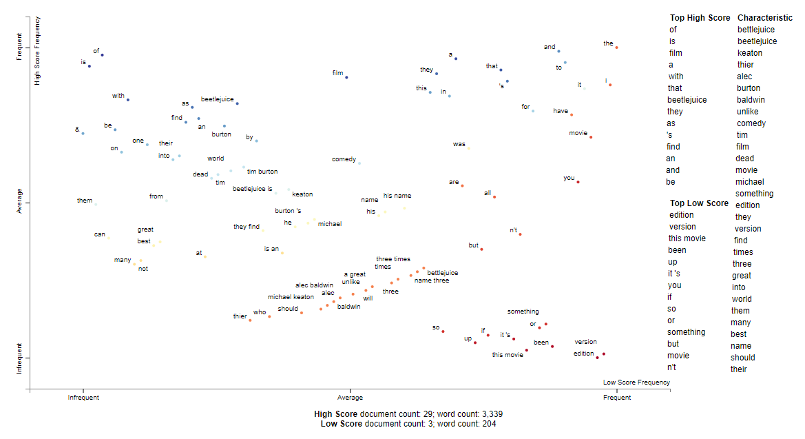
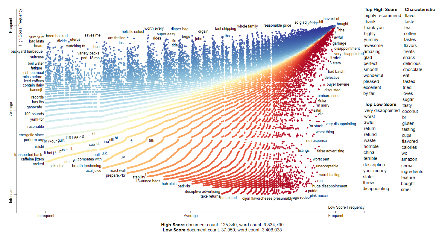
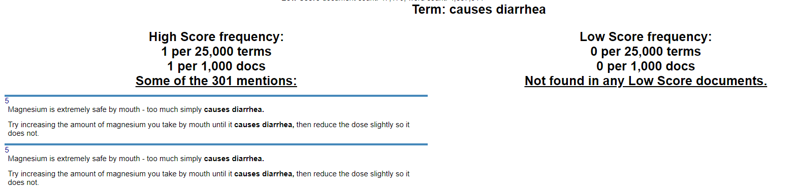
2012 shows similar trends as before. We can see that people are still complaining about things made in China. It seems matcha and magnesium are very highly rated. In the plot, we can see certain products people don’t seem to like such as hammer products and potentially turbinado sugar. People also seem to be wary of propylene glycol which is a flavorless additive to food. Looking at some of the strange postiive frequent words, we can see that there is review replication such as for causes diarrhea.
Additionally, when some of the odd tokens for which are highly positive ratings or negative ratings, we can see problems with the data. For example, in the image below, we can see diahrrea which was considered a postive feature being overrepresented in the dataset due to copy and paste problems.
Conclusion
This dataset for Fine Foods Reviews shows several trends. We have some understanding of the longitudinal effect of product age and reviewer experience. As writers become more experienced, the length of their reviews get longer. In addition, the summary of the reviews also seem to get longer. Additionally, older products have more variation in the review scores. Finally, using scattertext we can see some of the text features which are associated with higher or lower ratings for the product which eventually shifts to a more semnatic based relationship. We can also quickly understand that this dataset is not very clean at all. The analysis done here has many directions to take including data cleaning in order to eventually build a classification model or recommender.
References
Amazon Fine Foods Review
J. McAuley and J. Leskovec.
From amateurs to connoisseurs: modeling the evolution of user expertise through online reviews.. WWW, 2013.
VaderSentiment
Scattertext
Stevia